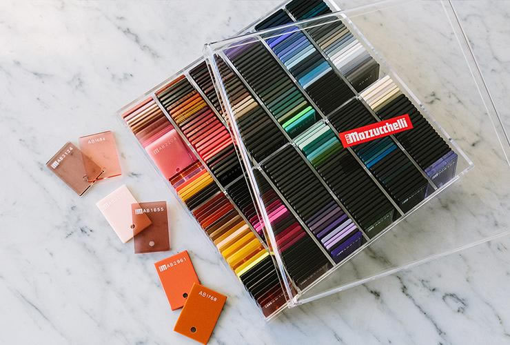
From acetate swatch to collection story: how color choices become easier to review.
A strong color direction becomes much easier to manufacture when the reference is specific. Start with the base tone, transparency, pattern, layer order and the part of the frame where each effect should appear.
Make the visual direction measurable
A swatch board helps the team compare colors under consistent light and record which tones belong on the front, temple or inner layer. It also gives the brand a clear reference for sampling feedback.
Review the frame as a complete object
Color interacts with thickness, bevels, hinges and lens tint. Reviewing a frame sample rather than a flat swatch alone helps confirm how the pattern reads when the frame is worn and photographed.